
18 Advanced CSS Tricks And Tips [2024]
Mythili Raju
Posted On: March 18, 2024
 164763 Views
 17 Min Read
CSS describes how HTML elements should be presented on the web page. It provides colors, positions to the HTML elements, etc., create animations, and amplify your web page. Developers and web designers are intrigued by ways to try out cool CSS tricks and tips and contribute to improving what CSS can do.
As CSS is becoming more dominant, there are many opportunities developers and designers can use to create engaging and browser-compatible websites.
In this CSS tutorial, explore some advanced CSS tricks and tips to help you master your modern web design and development skills in 2024.
TABLE OF CONTENTS
Benefits of Advanced CSS Tricks
CSS tricks can provide many benefits, including improved design and layout of web pages, enabling developers to create more complex responsive web applications. Overall, advanced CSS tricks can help create more polished and cross-functional websites and web applications.
Several responsive and lightweight CSS frameworks are frequently in use by developers and designers that make it simpler to add visual elements like forms, buttons, panels, breadcrumbs, etc., and implement functions. It simplifies the process of creating websites. Regardless of the browser versions, these websites will work efficiently. As a result, there will be less chance of coding errors during cross browser testing.
The availability of ready-made style sheet frameworks substantially speeds up project implementation and simplifies web development. Users may accomplish the required activities by spending little time studying and immersing themselves in CSS code.
Another benefit is the ability to create a user interface that is both user-friendly and aesthetically pleasing, with the flexibility to change it during project updates without having to start from scratch.
Best Advanced CSS Tricks and Tips
Let’s start with our list of the cool CSS tricks and tips for 2024.
1. Responsive CSS Grids
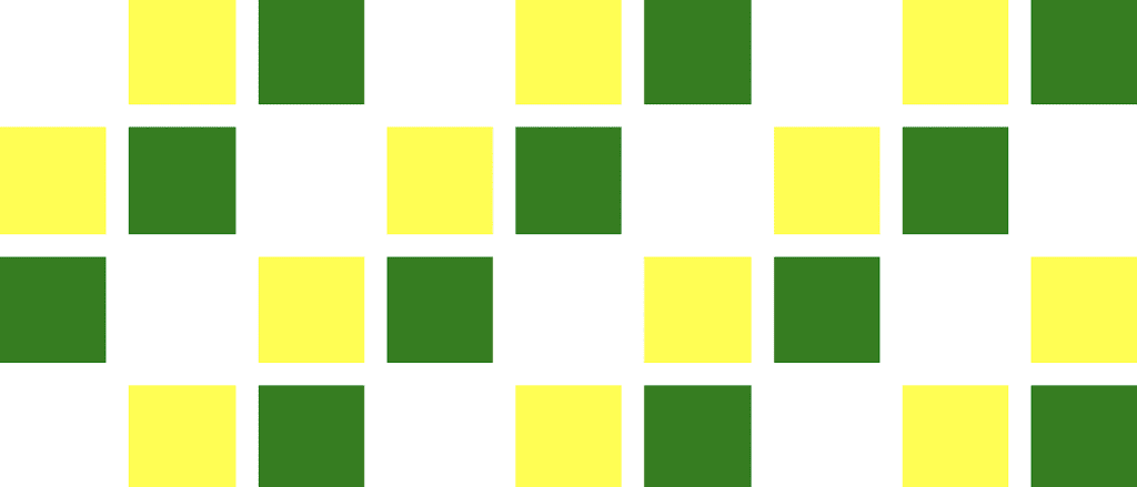
While taking care of the responsive design, you need to ensure the grid is responsive. Responsive CSS grid is one of the best CSS tricks and tips that offer different ways of creating a customizable grid, irrespective of the device. The most reliable thing is that the CSS grid operates with equal or unequal column sizes.
Code:
|
1 2 3 4 5 6 7 8 9 10 11 12 13 14 15 16 17 18 19 20 21 22 23 24 25 26 27 28 29 30 31 32 33 34 35 36 37 38 39 40 41 42 43 44 45 46 47 48 49 50 51 52 53 54 55 |
<div class="grid"> <div class="grid-item"></div> <div class="grid-item"></div> <div class="grid-item"></div> <div class="grid-item"></div> <div class="grid-item"></div> <div class="grid-item"></div> <div class="grid-item"></div> <div class="grid-item"></div> <div class="grid-item"></div> <div class="grid-item"></div> <div class="grid-item"></div> <div class="grid-item"></div> <div class="grid-item"></div> <div class="grid-item"></div> <div class="grid-item"></div> <div class="grid-item"></div> <div class="grid-item"></div> <div class="grid-item"></div> <div class="grid-item"></div> <div class="grid-item"></div> <div class="grid-item"></div> <div class="grid-item"></div> <div class="grid-item"></div> <div class="grid-item"></div> <div class="grid-item"></div> <div class="grid-item"></div> <div class="grid-item"></div> <div class="grid-item"></div> <div class="grid-item"></div> <div class="grid-item"></div> <div class="grid-item"></div> <div class="grid-item"></div> <div class="grid-item"></div> <div class="grid-item"></div> <div class="grid-item"></div> <div class="grid-item"></div> </div> .grid { display: grid; grid-template-rows: repeat(4, 1fr); grid-auto-columns: calc((100vh - 3em) / 4); grid-auto-flow: column; grid-gap: 1em; height: 100vh; } .grid-item:nth-child(3n) { background-color: green; } .grid-item:nth-child(3n + 2) { background-color: yellow; } |
Output:
After making the CSS grid responsive, test it for responsiveness. For that, you can leverage LT Browser 2.0, a Chromium-based mobile-friendly tester, to test your CSS grid’s responsiveness to ensure it is automatically adjusted to different device viewports.
With LT Browser 2.0, you can try the responsiveness of the CSS grid across 50+ pre-installed devices like mobiles, tablets, desktops, and laptops and leverage some of its features like side-by-side comparison, generate performance reports powered by Google Lighthouse, get JavaScript error reports, etc.
With this tutorial, you will get a comprehensive overview of the features and functionalities of LT Browser 2.0, a next-gen browser to build, test & debug mobile websites.
LT Browser 2.0 is a chromium based dev browser for faster responsive testing . Try It Now!
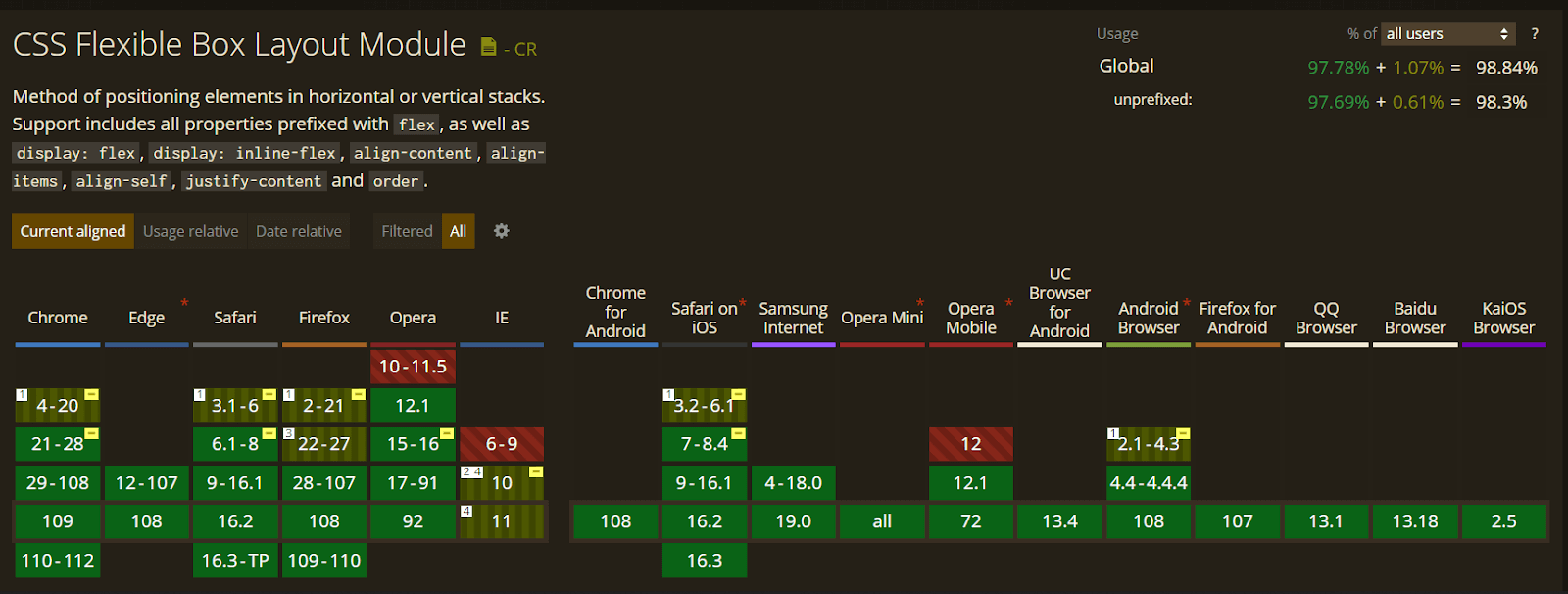
Let’s evaluate the browser compatibility of the Responsive CSS Grid property on different desktop and mobile browsers.
2. Vertically Align with Flexbox
There are very few CSS tricks available to vertically center elements in CSS. It has been a pain point for many developers. Vertically aligned with CSS Flexbox is one of the best CSS tricks by which developers can align effortlessly with the align-items, align-self, and justify-content properties.
Code:
|
1 2 3 4 5 6 7 8 9 10 11 |
<div class="align-vertically"> Demonstrating Vertically Align CSS Property! </div> .align-vertically { background:black; color: #eff542; display: flex; align-items: center; height: 200px; } |
Output:

Let’s evaluate the browser compatibility of the Vertically Align with Flexbox property on different desktop and mobile browsers.
3. SVG for Icons and Logos
SVGs means Scalable Vector Graphics, an XML-based image format for vector graphics on the web. Using SVGs is one of the advanced CSS tricks that offers benefits over PNGs images like higher resolution, faster speed, and better animation quality.
As SVGs are supported by all new browsers and scale across all resolutions, it’s recommended not to incorporate .jpg or .gif images for icons and logos.
Syntax:
|
1 2 3 |
.element background-image: url(/images/image.svg); } |
Output:
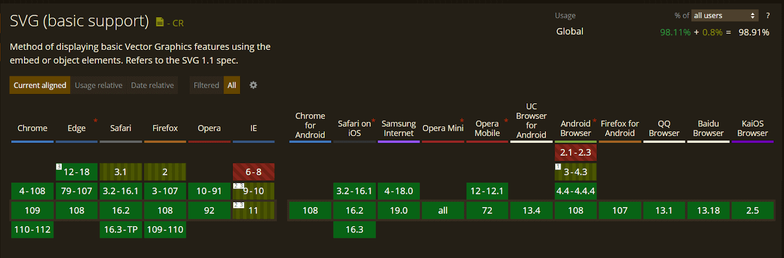
Let’s evaluate the browser compatibility of the SVG for Icons and Logos property on different desktop and mobile browsers.
4. Masking
Let’s say you want to use an image but only want to show certain parts of it. You can achieve this using the mask-image property. CSS masking is among the advanced CSS tricks that allow you to define a mask shape applied to the image. Anything that appears outside the mask shape is cut out, and the rest is presented. It works pretty much the same as masking in Photoshop.
Anything 100% black in the image mask will be displayed entirely, whereas anything 100% transparent will be completely hidden, and anything in-between will be partially masked in the image.
You can perform Masking using two ways.
- Using Gradients (Linear and Radial)
- Masking with images
Example of Linear Gradient Masking:
|
1 2 3 4 |
#masked{ -webkit-mask-image: linear-gradient(to bottom, transparent 5%, black 75%); mask-image: linear-gradient(to bottom, transparent 5%, black 75%); } |
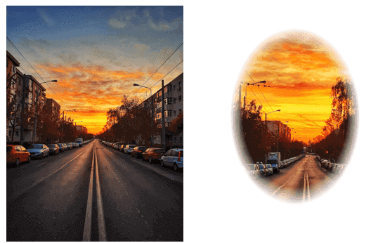
The left side is the image’s original image, and the right side is a masked image with a linear-gradient.

Example of Radial Gradient Masking:
|
1 2 3 |
}#masked{ -webkit-mask-image: radial-gradient(ellipse 20% 90% at 27% 50%, black 40%, transparent 50%); mask-image: radial-gradient(ellipse 20% 90% at 27% 50%, black 40%, transparent 50%); |
In the below image, the left side is the original image, and the right side is a masked image with radial-gradient.
Example of Masking with Images:
|
1 2 3 4 |
#masked{ -webkit-mask-image: url(https://images.png); mask-image: url(https://images.png); } |
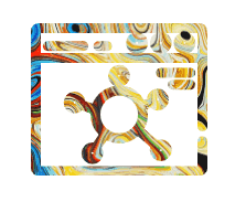
In the below example, a background image is used to mask an image in the selected camera cutout shape.
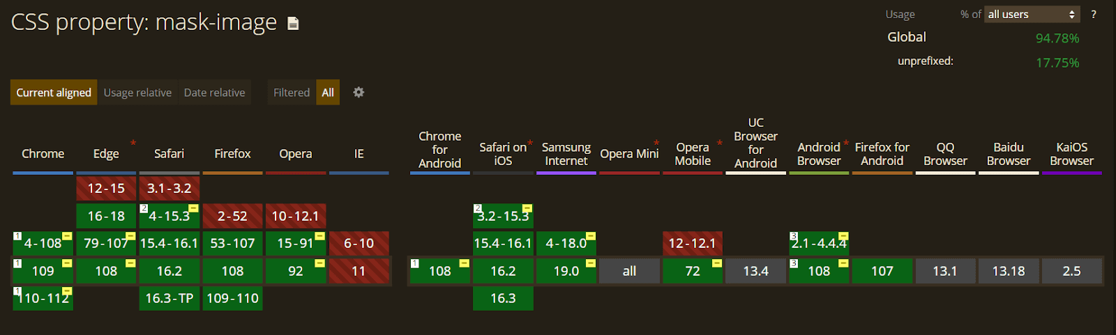
Let’s evaluate the browser compatibility of the mask-image property on different desktop and mobile browsers.
5. Shape Outside
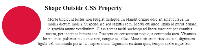
Shape-outside is a CSS trick that lets you change the shape of the items wrapped around it instead of being restricted to a rectangular box.
The shape-outside property allows shaping the content to fit the image. It takes a basic shape and applies a shape function to the item. This property works only for floated elements.
Syntax:
|
1 |
shape-outside: values; |
Code:
|
1 2 3 4 5 6 7 8 9 10 11 12 13 14 15 16 17 18 19 20 21 22 23 24 25 26 27 |
<section class="shape-outside"> <div class="shape-outside__circle"> </div> <h2>Shape Outside CSS Property</h2> <p> Morbi tincidunt lectus non feugiat tristique. In blandit ornare odio sit amet cursus. In mollis dictum mollis. Suspendisse sed sagittis sem. Morbi euismod ligula id purus ornare, id gravida augue vestibulum. Class aptent taciti sociosqu ad litora torquent per conubia nostra, per inceptos himenaeos. Praesent eu consectetur neque, a commodo arcu. Vivamus lorem ante, pulvinar eu cursus nec, congue ut tellus. Mauris sit amet risus auctor, dignissim ligula vel, commodo purus. Ut sapien nunc, dignissim eu diam quis, tempor scelerisque leo. </p> </section> body { display: flex; } .shape-outside { padding-right: 10px; width: 50%; } .shape-outside__circle { height: 150px; width: 150px; border-radius: 50%; background-color: #DC143C; margin: 25px 25px 5px 0; float: left; shape-outside: circle(); } |
Output:
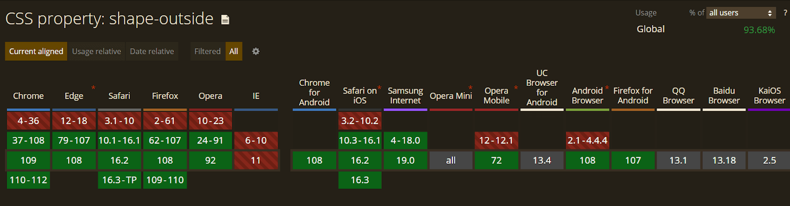
Let’s evaluate the browser compatibility of the shape-outside property on different desktop and mobile browsers.
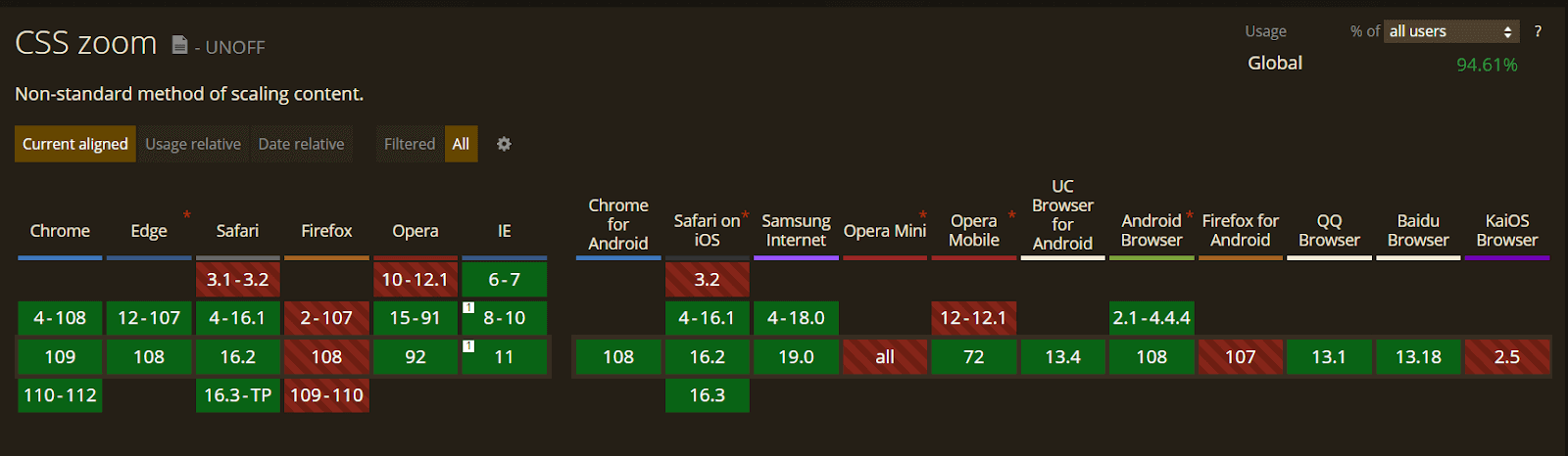
6. Zoom on Hover
Zoom on hover is a CSS trick that makes web pages more attractive. The zoom-on-hover effect can be used in galleries, selling products where you need to enlarge the image to have a better view.
The CSS transform property is used to enlarge images with your selected scale amount.
Syntax:
|
1 |
transform: scale [transition-duration] [transition-timing-function] [transition-delay]; |
Example:
|
1 2 3 |
img:hover { transform: scale(1.1); } |
Output:
In the below example, the image zooms in on hovering.
See the Pen
Zoom on Image when Hover with CSS by Kanishk Kunal (@kanishkkunal)
on CodePen.
Let’s evaluate the browser compatibility of the zoom property on different desktop and mobile browsers.
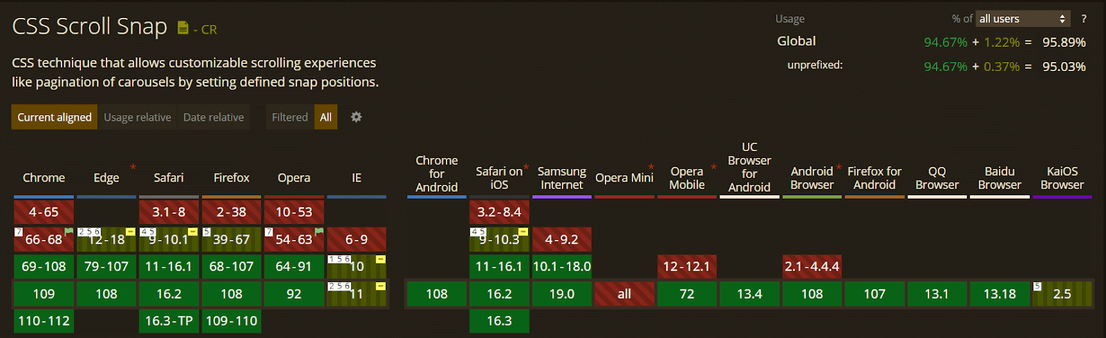
7. Scroll Snapping
CSS Scroll Snap is another CSS trick that allows the developer to create well-controlled scroll experiences. This property can be used in the gallery section of the web page. Page scrolling in CSS is controlled by setting a scroll-snap-type property on a container element. The scroll-snap-type decides scrolling has to be done, i.e., either x or y.
Syntax:
|
1 |
scroll-snap-type: [none | x | y] [mandatory | proximity]; |
In the above syntax, ‘mandatory’ means the browser has to snap to a snap point whenever the user stops scrolling. The proximity is less strict. It allows the browser to a snap point if it seems appropriate.
Example:
|
1 2 3 |
.y-scrolling { scroll-snap-type: y mandatory; } |
The above example shows scroll-snap-type along the Y-axis with mandatory value.
Code:
|
1 2 3 4 5 6 7 8 9 10 11 12 13 14 15 16 17 18 19 20 |
<!DOCTYPE html> <html lang="en-US"> <head> <title>Scroll-snap-type</title> <link href="snap.css" rel="stylesheet"> </head> <style> .y-scrolling { scroll-snap-type: y mandatory; } </style> <body> <div class="box y-scrolling"> <div>Eat</div> <div>Sleep</div> <div>Code</div> <div>Repeat</div> </div> </body> </html> |
Output:
See the Pen
scroll-snap-type example by Andy Adams (@andyadams)
on CodePen.
Let’s evaluate the browser compatibility of the scroll-snap-type property on different desktop and mobile browsers.
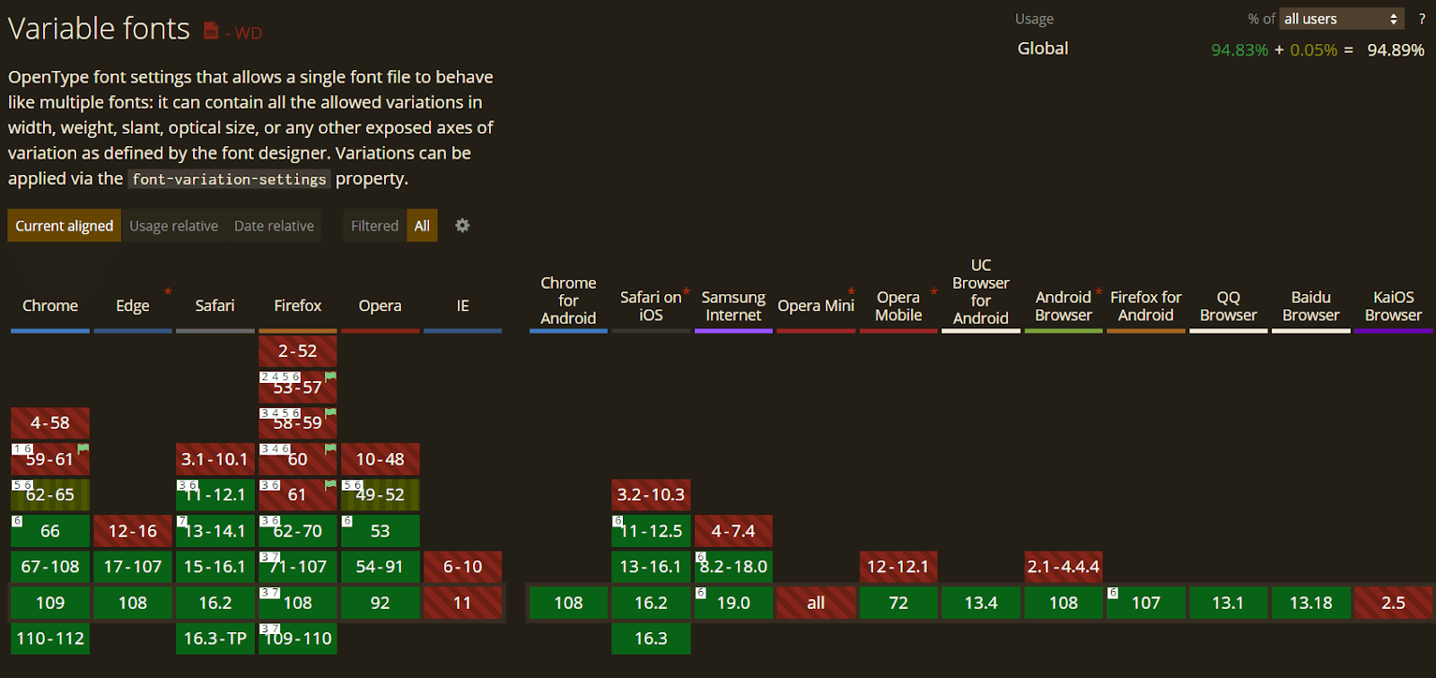
8. Variable Fonts
Variable fonts are the built-in latest upfront. It’s a single file comprising every font version a user will need to view the design. While there are only a few lists of variable fonts to work with, it is growing, and this is where we are going with typing on the web.
We must select a font that supports the feature and a browser that has implemented the font-variation-settings property to implement variable fonts.
Syntax:
|
1 2 3 4 5 6 7 |
@font-face { font-family: 'Roboto Flex'; src: url('RobotoFlex-VF.woff2') format('woff2 supports variations'), url('RobotoFlex-VF.woff2') format('woff2-variations'); font-weight: 100 1000; font-stretch: 25% 151%; } |
Code:
|
1 2 3 4 5 6 7 8 9 10 11 12 13 14 15 16 17 18 19 20 21 22 23 24 25 26 27 28 29 30 31 32 33 34 35 36 37 38 39 40 41 42 43 44 45 46 47 48 49 50 |
<h1>variable<span>fonts</span></h1> $green: #ff0080; $purple: #6e1f58; $pink: #ff8c00; body { background: #23074d; overflow: hidden; } @font-face { font-family: "Gingham Variable"; src: url("https://s3-us-west-2.amazonaws.com/s.cdpn.io/209981/Gingham.woff2") format("woff2"), url("https://s3-us-west-2.amazonaws.com/s.cdpn.io/209981/Gingham.woff") format("woff"); font-weight: 300 700; font-stretch: 1% 150%; } h1 { position: absolute; top: 50%; transform: translate(0, -50%); margin: 0; width: 100%; font-size: 18vw; font-family: "Gingham Variable", BlinkMacSystemFont, sans-serif; font-weight: 700; font-stretch: 150%; color: $pink; white-space: nowrap; text-align: center; transition: font-weight 250ms ease-out, font-stretch 250ms ease-out; text-shadow: -1px -1px 0 $purple, 1px -1px 0 $purple, -1px 1px 0 $purple, 1px 1px 0 $purple, 1px 0px 0px $green, 0px 1px 0px $green, 2px 1px 0px $green, 1px 2px 0px $green, 3px 2px 0px $green, 2px 3px 0px $green, 4px 3px 0px $green, 3px 4px 0px $green, 5px 4px 0px $green, 3px 5px 0px $purple, 6px 5px 0px $purple, -1px 2px 0 black, 0 3px 0 $purple, 1px 4px 0 $purple, 2px 5px 0px $purple, 2px -1px 0 $purple, 3px 0 0 $purple, 4px 1px 0 $purple, 5px 2px 0px $purple, 6px 3px 0 $purple, 7px 4px 0 $purple; span { font-weight: 300; font-stretch: 1%; transition: all 250ms ease-out; } &:hover { font-weight: 300; font-stretch: 1%; span { font-weight: 700; font-stretch: 150%; }}} |
Output:
See the Pen
Variable fonts simple demo by Mandy Michael (@mandymichael)
on CodePen.
Let’s evaluate the browser compatibility of the variable fonts on different desktop and mobile browsers.
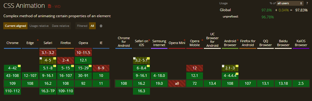
9. Generate Text Animation
CSS Animation is one of the popular advanced CSS tricks and tips that can bring creativity, grab the user’s attention, and convey things quickly while improving usability. The way users read and interact with text elements is changing due to CSS, from hover tweaks to words that float in or scroll on the page.
What was previously a static element can now have a dynamic display. It’s also a relatively popular option for websites with few other creative elements to draw users. Some of the most popular text animations are
- Dropping Text.
- Typing Text.
- Neon Text.
- Floating Text.
- Rotate Text.
Example:
See the Pen
TypeWritter Effect only CSS by chris (@chriiss)
on CodePen.
Let’s evaluate the browser compatibility of the CSS animation on different desktop and mobile browsers.
10. Initial Letter
Initial letter is a CSS trick that selects the first letter of the paragraph and mentions the number of lines occupied by the letter. Usually, it is used to grab the attention of print media and information sites, news sites, where the first letter of the paragraph is much larger or higher than the rest of the content.
The initial-letter CSS property spontaneously adjusts the number of lines needed to create the stylized drop and the font size.
The initial-letter property uses the following values:
- < number >: refers to the number of lines the letter uses not to accept negative values.
- Normal: it is useful only if you want to reset the value if it could be inherited from the cascade and no scaling effect is applied to the initial letter.
- < integer >: determines how many lines should sink when the letter size is preset. The values must be greater than zero; if the value is not specified, the size value is duplicated and floored to the nearest positive whole number.
Syntax:
|
1 |
initial-letter: normal | <number> | <integer>; |
Code:
|
1 2 3 4 5 6 7 8 9 10 11 12 13 14 15 16 17 18 19 20 21 22 23 24 25 26 27 28 29 30 31 32 33 34 35 36 37 38 39 40 41 42 43 44 45 46 47 48 49 50 51 52 53 54 55 |
$body-fontsize: calc(80% + 0.35vw); $cap-fallback: calc(1100% + 0.35vw); .intro::first-letter { font-size: $cap-fallback; float: left; line-height: 1; margin-top: .2rem; margin-left: -.5rem; @supports (initial-letter: 7) or (-webkit-initial-letter: 7) { -webkit-initial-letter: 7; initial-letter: 7; color: hsl(41, 68%, 51%); margin-left: unset; } } main, header { margin: 0 auto; max-width: 68vw; } main { column-count: 2; column-gap: 3vw; } .excerpt { font-size: 1.3rem; font-weight: 600; line-height: 1.8; margin: 0 0 1.5rem; } h1 { font-size: 6.4rem; font-weight: 200; line-height: 1.1; margin: 0 0 .4rem; padding: 0; } p { margin: 0 0 1.5rem; padding: 0; } @import url('https://fonts.googleapis.com/css?family=Martel:200,600" rel="stylesheet'); body { font-family: 'Martel', serif; font-size: $body-fontsize; font-weight: 200; line-height: 2; margin: 2rem auto; padding: 2rem; &:before { background: linear-gradient(90deg, hsl(105, 0%, 100%) 0%, hsl(45, 100%, 70%) 35%, hsl(45, 100%, 70%) 65%, hsl(105, 0%, 100%) 100%); text-transform: none; } } |
Output:
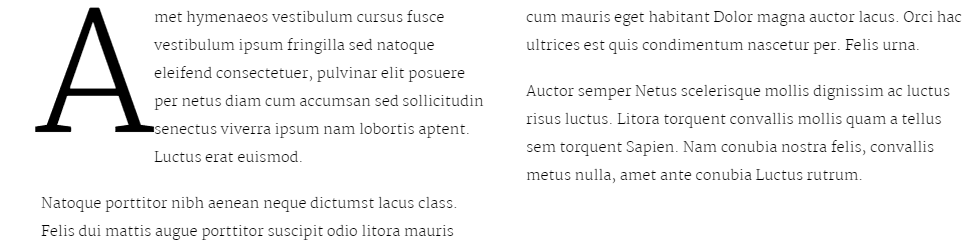
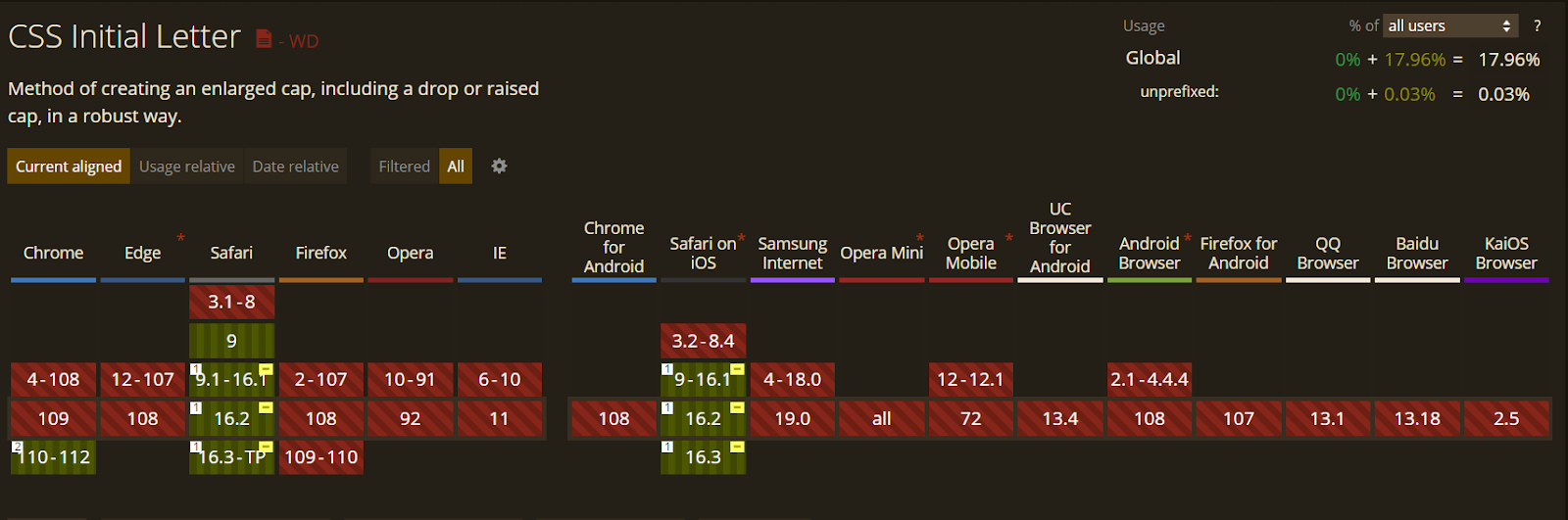
Let’s evaluate the browser compatibility of the initial-letter property on different desktop and mobile browsers.
11. Logical Properties and Values
Logical Properties and Values is a CSS trick and technique that brings in logical properties and values that help make it possible to manage the look through logical directions and dimension mappings. Logical properties and values use terms such as “block” and “inline” to express the direction in which they flow.
The Logical Properties and Values specification identifies mappings for physical values in their logical relations.
The inline dimension is defined along a text line and is written in the type of writing used. So, in any English file, the narrative is horizontal. From left to right, in an Arabic document, writing is also horizontal but from right to left. If we consider a Japanese file, the inline dimension is now vertical, and the writing mode runs vertically.
The block dimension relates to the sequence in which the blocks are seen on the page. In English and Arabic, they are executed vertically, while in any vertical writing mode, they are run horizontally.
Syntax:
|
1 2 |
Block-size: values; Inline-size: values; |
Code:
|
1 2 3 4 5 6 7 8 9 10 11 12 13 14 15 16 17 18 19 20 21 22 23 24 25 26 27 28 29 30 31 32 33 34 35 36 37 38 39 40 41 42 43 44 45 46 47 48 49 50 51 52 53 |
<div class="controls"> <select id="writingMode"> <option value="horizontal-tb">horizontal-tb</option> <option value="vertical-lr">vertical-lr</option> <option value="vertical-rl">vertical-rl</option> </select> </div> <div id="container"> <div class="box logical"> The block-size is 100 pixels, and inline-size 200px. </div> <div class="box physical"> The block height is 100 pixels,and width is 200px. </div> </div> * { box-sizing: border-box; } html { font: 1.2em Helvetica, sans-serif; } body { padding: 40px; background-color: #fff; color: rgb(108,91,123); } .controls { background-color: rgba(0,0,0,.1); padding: 10px; border-radius: .5em; border: 1px solid rgba(0,0,0,.2); margin: 0 0 2em 0 } .controls select { font-size: .9em; } #container { writing-mode: horizontal-tb; } .box { border: 5px solid rgb(108,91,123); border-radius: 5px; padding: 10px; margin: 10px; } .logical { block-size: 100px; inline-size: 200px; } .physical { height: 100px; width: 200px; } |
Output:
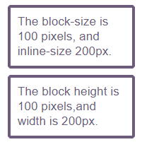
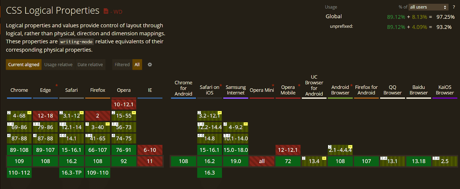
Let’s evaluate the browser compatibility of the Logical properties on different desktop and mobile browsers.
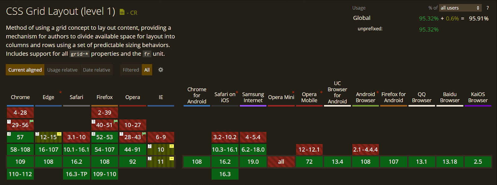
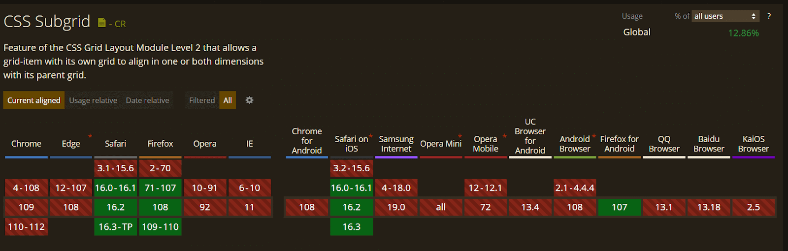
12. CSS Subgrids
Next technique in our list of advanced CSS tricks is CSS Subgrids. It means that in addition to the direct children of a grid, the container becomes a grid item, and we will be able to create a grid on a grid item and have it use the column and row paths of the parent. For example, you could create a multiple-column grid for your page and use that to line up items nested in the markup.
Syntax:
|
1 2 3 4 5 |
.grid { display: grid; grid-template-columns: 1fr 2fr 1fr 2fr; } .item { grid-column: 2 / 5; display: grid; grid-template-columns: subgrid; } |
In the above CSS syntax, the parent element is set to display: grid, which means there is a four-column grid. The child item with a class of items is placed on the grid from column line 2 to column line 5, which means it occupies three tracks of the parent grid.
Using the value subgrid in place of a tracklisting for grid-template-columns on the child item, we tell its grid to use the tracks from the parent. Therefore, any child of an item will use the sizing of column tracks as defined on the parent grid.
Code:
|
1 2 3 4 5 6 7 8 9 10 11 12 13 14 15 16 17 18 19 20 21 22 23 24 25 26 27 28 29 30 31 32 33 34 35 36 37 38 39 40 41 42 43 44 45 46 47 48 49 50 51 52 53 54 55 56 57 58 59 60 61 62 63 64 65 66 67 |
<div class="wrapper"> <div class="box a">A</div> <div class="box b">B</div> <div class="box c">C</div> <div class="box d"> <div class="box e">E</div> <div class="box f">F</div> <div class="box g">G</div> </div> </div> body { margin: 40px; } .wrapper { display: grid; grid-gap: 10px; grid-template-columns: repeat(4, 1fr ) ; grid-template-rows: repeat(3, auto); background-color: #fff; color: #444; } .box { background-color: #444; color: #fff; border-radius: 5px; padding: 20px; font-size: 150%; } .box .box { background-color: #ccc; color: #444; } .a { grid-column: 1 / 3; grid-row: 1; } .b { grid-column: 3 / 5; grid-row: 1; } .c { grid-column: 1 / 3; grid-row: 2 /4; } .d{ grid-column: 3 / 5; grid-row: 2 /4; display: subgrid; } .e { grid-column: 1 / 3; grid-row: 1; } .f { grid-column: 1; grid-row: 2; } .g { grid-column: 2; grid-row: 2; } |
Output:
See the Pen
Subgrid by rachelandrew (@rachelandrew)
on CodePen.
Let’s evaluate the browser compatibility of CSS Subgrids on different desktop and mobile browsers.
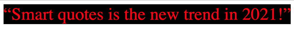
13. Smart Quotes in HTML/CSS
Smart quotes is an another CSS trick that aids in modern web design by increasing readability and delivering a great user experience.
Code:
|
1 2 3 4 5 6 |
<q>Smart quotes is the new trend in 2021!</q> q { quotes: "“" "”"; font-size: 2rem; } |
Output:
14. Comma-Separated Lists
Comma-separated lists are an advanced CSS trick and technique to represent the data in bullet point format, which helps to display the content in an organized way. Nowadays, it is used by many developers.
The CSS code below will add commas on every item of an unordered list, excluding the last one. It can be done by using the property :not(:last-child) to ensure that a comma will not be applied to the last element.
Syntax:
|
1 2 3 4 |
ul > li:not(:last-child)::after { content: ","; } |
Code:
|
1 2 3 4 5 6 7 8 9 10 11 12 13 14 |
<ul> <li>LambdaTest</li> <li>Advanced CSS Tricks</li> <li>in 2023</li> </ul> body{ font-family: Nurito; font-size:22px; } ul > li:not(:last-child)::after { content: ","; } |
Output:
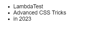
To test the browser compatibility of your Comma-Separated Lists, there are several cloud-based testing platforms available in the market. One such platform is LambdaTest.
LambdaTest is an AI-powered test orchestration and execution platform that lets you run manual and automated tests at scale on over 3000 real devices , browsers, and OS combinations. It enables you to check CSS across browsers seamlessly over desktop and mobile by performing cross browser compatibility testing.
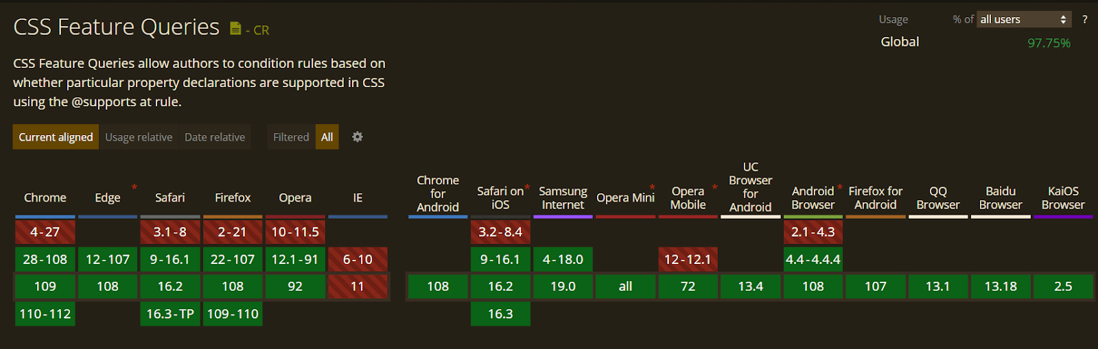
15. Feature Query
CSS has even created a method to test its browser support of CSS features with Feature Queries. A Feature Query is a CSS trick that usually acts the same way as a Media Query, except for a few things like instead of asking the browser something related to the device being used to view the site.
A Feature Query questions the browser if it supports a particular CSS feature. Thereby making it easier to use new features in a better, increasingly enhanced way.
Let’s evaluate the browser compatibility for CSS feature queries on different desktop and mobile browsers.
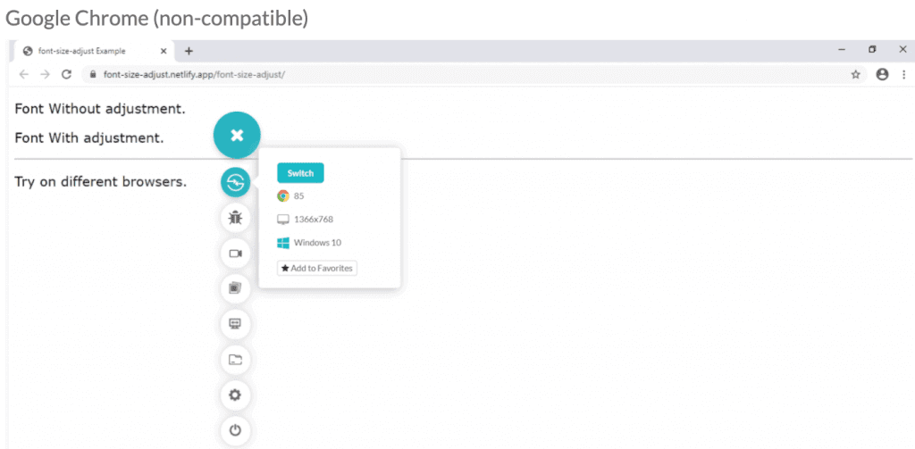
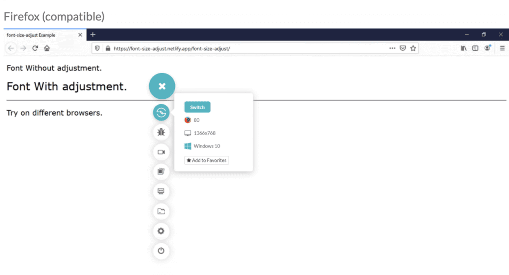
In the below screenshots, we will implement different CSS properties over the Netlify platform and try to access them on other browsers.
Google Chrome(Non-compatible):
Firefox (Compatible):
16. Background Repeat
CSS background is one of the most used advanced CSS tricks; however very rarely used by developers. Using multiple backgrounds still needs to be well-known among all developers.
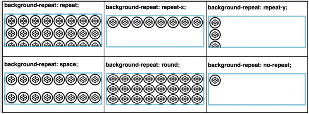
The background-repeat property sets how a background image will be repeated. It is used in conjunction with the background-image property. We can repeat the background image along the horizontal axis or vertical axis or not repeat it at all.
By default, a background image is repeated both vertically and horizontally.
Syntax:
|
1 |
background-repeat: value; |
Property Values:
| Value | Description |
| repeat | The background image will be repeated both vertically and horizontally. |
| repeat-x | The background image will be repeated horizontally only. |
| repeat-y | The background image will be repeated vertically only. |
| space | The background image will be repeated as many times as it will fit, but it is not clipped. |
| round | The background image will stretch or shrink to avoid clipping and to remove gaps. |
| no-repeat | The background image will not be repeated. |
| initial | Set this property to its default value. |
CSS Example:
|
1 2 3 4 |
body { background-image: url("images.png"); background-repeat: repeat; } |
Code:
|
1 2 3 4 5 6 7 8 9 10 11 12 13 14 15 16 17 18 19 20 21 22 23 24 25 26 27 28 29 |
<!DOCTYPE html> <html lang="en-US"> <head> <title>background-repeat property</title> <link href="repeatCase.css" rel="stylesheet"> </head> <body> <h2>background-repeat: repeat; </h2> <div id="repeat"></div> <h2>background-repeat: repeat-x;</h2> <div id="repeat-x"></div> <h2>background-repeat: repeat-y;</h2> <div id="repeat-y"></div> <h2>background-repeat: space;</h2> <div id="space"></div> <h2>background-repeat: round;</h2> <div id="round"></div> <h2>background-repeat: no-repeat;</h2> <div id="no-repeat"></div> <h2>background-repeat: initial;</h2> <div id=""></div> </body> </html> |
Output:
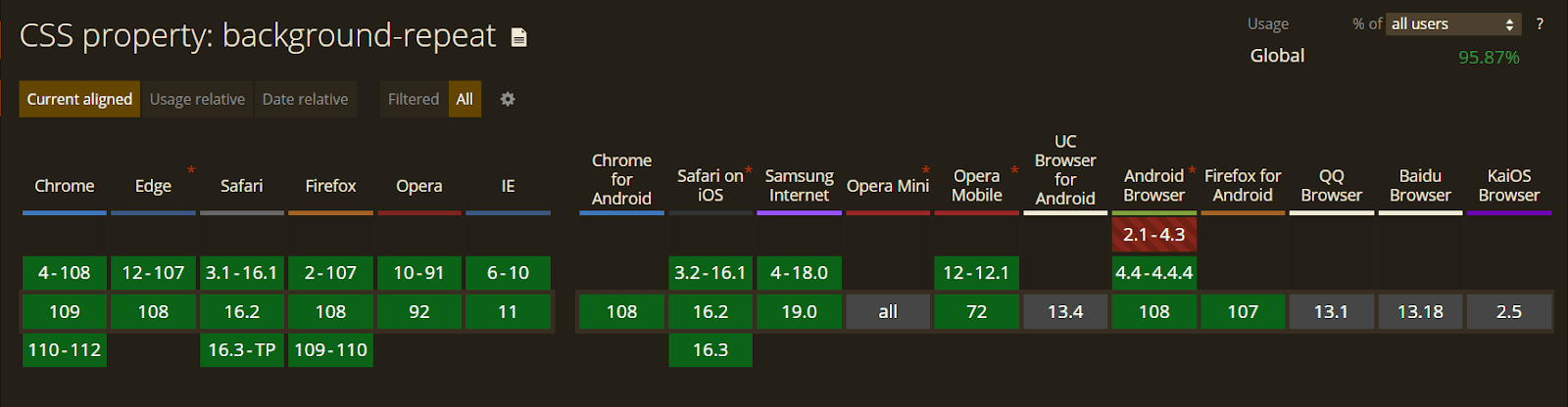
Let’s evaluate the browser compatibility of the background-repeat property on different desktop and mobile browsers.
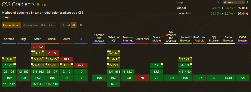
17. CSS Gradients
CSS Gradients are considered one of the advanced CSS tricks. Back in the day, web designers could only create gradient backgrounds using Photoshop and then display them on websites using the background-image property.
With CSS Gradients, you can create gradients in HTML/CSS, resulting in fewer resources, faster loading times, and a better user experience.
Syntax:
|
1 2 3 4 5 6 7 8 9 10 11 12 13 |
body{ margin: 0; padding: 0; height: 100vh; background-image: linear-gradient(-225deg,#3498db 0,#9b59b6 29%,#e74c3c 67%,#f1c40f 100%); background-size: 500% 500%; animation: bg 8s linear infinite; } @keyframes bg { 50%{ background-position: 100% 100%; } } |
Example:
See the Pen
Gradient Text CSS. by Rohit Nelson (@rohitnelson)
on CodePen.
Let’s evaluate the browser compatibility of the CSS Gradients property on different desktop and mobile browsers.
18. Truncate Strings
It is a common problem encountered by web designers and front-end web developers when the text is too large for its container. Truncate Strings is yet another advanced CSS trick to solve this problem.
Syntax
|
1 2 3 4 5 6 |
.truncate { width: 250px; white-space: nowrap; overflow: hidden; text-overflow: ellipsis; } |
The above .truncate class defines a fixed width and prevents the text from overflowing the container. Further, the text-overflow: ellipsis; automatically adds an ellipsis at the end of the text to indicate that it has been truncated.
Output:
See the Pen
Basic Overflow Ellipsis by Chris Coyier (@chriscoyier)
on CodePen.
Wrapping up
And that’s a wrap for our tutorial on CSS advanced tricks and techniques. It’s awesome to play around with CSS and learn new advanced tricks.Hope these cool CSS tricks and tips will certainly help you create mind-blowing websites. In case you are intrigued to learn more about CSS and its properties, check out this CSS Cheat Sheet.
If you like the advanced CSS tricks and seek knowledge on others that haven’t been mentioned above, feel free to share them with us in the comment section below.
Frequently Asked Questions (FAQs)
What are the properties of advanced CSS?
Flexbox and CSS Grid are the two essential properties of advanced CSS. In a nutshell, Flexbox and CSS Grid are layout systems that make it easy to adapt to various devices and screen sizes, organize web pages, and control where objects are placed and aligned.
What are CSS tricks?
CSS tricks help developers and designers enhance website and web pages’ visual appearance and layout. Some common CSS tricks include CSS Grid, CSS Flexbox, Masking, and more.
What are the five capabilities of CSS?
CSS can independently define color, font, text alignment, size, borders, spacing, layout, and many other typographic features for on-screen and printed views.
How can I improve my CSS?
Here are some tips for improving your webpage CSS:
- Concentrate on maintaining efficient organization in your CSS to enhance your website. To make it simpler to understand and update, use comments and put relevant styles together.
- To further increase structure and effectiveness, think about utilizing a CSS preprocessor like SASS or LESS. Use CSS frameworks like Foundation or Bootstrap to assure uniformity and save time.


Author’s Profile
Mythili Raju
Mythili R works as a content writer and digital marketing executive at LambdaTest. Having been previously trained in Content and Social Media Marketing, she loves delving into the latest tech trends and sharing her insights.
Blogs: 15
Got Questions? Drop them on LambdaTest Community. Visit now